|
|
Here are some questions about this topic.
· Why do we use charts and graphs?
· We use graphs and charts to help us visualize information. The three main types of graphs are bar graphs, circle graphs (also called pie graphs), and line graphs. We can use a bar graph to help us compare values. For example, let’s say we wanted to figure out which family member eats the most apples per day. We would put the names of the family members along the horizontal or x-axis, and the number of apples each person eats per day along the vertical or y-axis. This way we could easily see who eats the most apples per day. To graph pieces of a whole, we would use a circle graph, or pie graph. A line graph helps us plot values across a period of time.
· chart - карта график, диаграмма, схема, таблица, чертёж
· graph - график, диаграмма, схема; кривая
· to graph- изображать в виде диаграммы, графика 2) наносить (данные) на график; чертить, вычерчивать (кривую, график, диаграмму) Syn: plot , trace
· How do we graph coordinates?
· To graph coordinates, you need to set up a grid, and divide it into four quadrants by drawing a big “+” through the middle. The vertical line (up and down) is the y axis. The horizontal line (side to side) is the x axis. The point where the lines intersect is called the origin and has a value of zero.
Any point to the right of the origin on the x axis is a positive number, and the values increase to infinity. All the points to the left of the origin are negative, and decrease to infinity. The points above the origin on the y axis are also positive numbers, increasing infinitely, and the points below the origin are negative.
When you’re given a set of coordinates, for example, (2, 3), the first number represents the x coordinate, and the second number represents the y coordinate. In our example, the x coordinate is 2, and the y coordinate is 3.
To graph this point, mark off the spot on your graph where the x coordinate equals 2. You can find it by starting at the origin, and moving two spaces to the right. Then, find the point where the y coordinate equals 3. You can do this by moving upward three spaces from the x axis. The point you end up with should be two spaces away from the origin along the x axis, and three spaces away from the origin along the y axis. Ta-daa! You've graphed a set of coordinates!
· to set up a grid -создать сетку, координатная сетка
· quadrant ['kwɔdr(ə)nt] 1) четверть окружности, круга, шара
· origin -начало координат
·
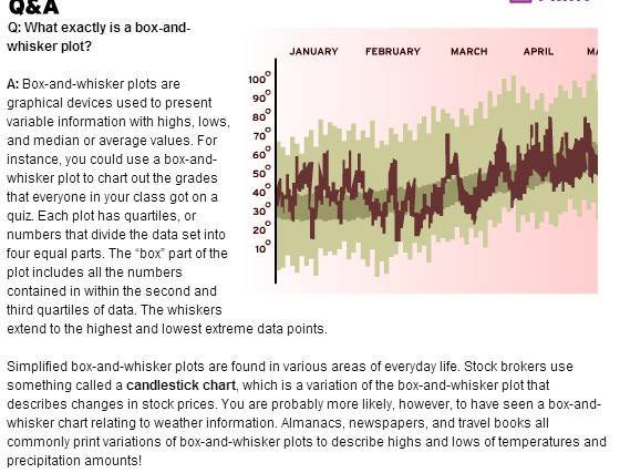
· What is a box-and-whisker graph?
·
A box-and-whisker plot is graph that shows how evenly data are distributed. It basically looks like a number line with the data identified above the line. The data are then graphed into what looks like a box with lines coming out of either side. The data are graphed according to 5 points: lower extreme, lower quartile, median, upper quartile, and upper extreme.
For example, take the following set of data: 2. 3, 4, 5, 5, 6, 7, 8, 8, 8, 9, 11. The lower extreme is the smallest number. So, 2 is the lower extreme in the set. The median is middle number (or the average of the two middle numbers). So, the median would be 6. The lower quartile is the median of the lower half of the set of data. So, the lower quartile would be (4 + 5)/2 = 4.5. The upper quartile is the median of the upper half of the set of data. So, the upper quartile would be (8 + 8)/2 = 8. The upper extreme is the greatest number in a set of data. So, 11 is the upper extreme.
· number line -числовая прямая
· lower extreme -нижняя крайняя
·
· What is a pictograph?
· A pictograph is a type of graph that uses pictures to represent data. For example, a pictograph showing how many people prefer chocolate ice cream to vanilla might use a picture of a chocolate ice cream cone to represent 10 people who like chocolate ice cream better. It’s just a way of helping people to visualize information!
· What is a circle graph?
· A circle graph looks sort of like a pie. That's why it’s sometimes called a pie chart. It’s used to illustrate percentages of a whole as “slices” of a pie. For example, imagine that somebody asked everybody in your class about their favorite types of cookies. Let's say that twenty-five percent of your class said they liked peanut butter cookies, twenty-five percent of them liked sugar cookies, and fifty percent liked chocolate chip cookies the best. First, you’d draw a circle to represent all the kids in your class. Next, you’d draw a line across the middle of the circle, cutting it into two equal halves. You’d color in half the circle, and indicate that it represents the fifty percent of your class that likes chocolate chip cookies. Next, you’d cut the remaining fifty percent into two equal parts. Each of these parts would represent 25 percent of the whole class. You’d color them in, and indicate that one section represents the 25 percent of the class that likes sugar cookies, and that the other represents the 25 percent that likes peanut butter cookies.
· How can I draw a two-dimensional x-y graph?
· Well, using graph paper and a ruler is a great way to keep your work neat. Draw two perpendicular lines on the graph paper—those are lines that intersect at a 90-degree angle. The point where the two lines meet is called the origin. Label the vertical axis “y” and the horizontal axis “x.” Next, number the squares. You can treat the x and y axes as number lines, with the origin at zero. The squares above and to the right of the origin are positive; the squares below and to the left of it are negative. Continue labeling as far as you need to go. Now you have your graph!
· graph paper -миллиметровка
· Can you tell me the difference between a speed-time graph and a distance-time graph?
· A speed-time graph shows the rate at which an object’s speed changes over time. Let’s say you wanted to measure the different speeds a car traveled at during a 10-minute drive. For example, let’s say it traveled at 30 kilometers per hour from minutes 1 through 4; 0 kilometers per hour during minute 5; and 25 kilometers per hour during minutes 6 through 10. You could plot the time on the x-axis, and the different rates of speed on the y-axis, and the graph would show you how the car’s speed changed over time.
A distance-time graph shows how much distance an object covers over a fixed period of time. Basically, the more time an object spends traveling, the more distance it covers. For example, you could measure how many miles a car travels in five minutes. You could plot the time on the x-axis, and the distance on the y-axis, and your graph would show how much distance the car covered in five minutes.
· How do you make a frequency table?
· A frequency table is a chart that lists how often items or events occur. It’s a way of displaying votes, grades, or just about anything in a way that’s easy to read. You list the categories in the left-hand column. Then you use the right-hand column to list how many items or events fall into that category. For example, let’s say you asked all 25 kids in your class what flavor of ice cream they liked best. Out of 25, 11 said they liked chocolate the best, 8 said vanilla, and 6 said strawberry. This is what your frequency table would look like:
· frequency table -таблица частот, частотная таблица
· How do you graph linear equations?
· Linear equations are algebraic formulas used to represent lines on something called the Cartesian Plane (a fancy way of saying "graph"). For two dimensional lines on an x/y graph, people use this equation:
y=mx+b
"m" represents the slope of the line. Slope is always expressed in the form of a fraction. The numerator represents the "rise" of the line (the vertical distance between points on a line). The denominator represents the "run" of the line (the horizontal distance between points on the line).
"b" is the y-intercept of the line. This is the actual point at which the line crosses the y-axis.
"x" is the independent variable. This is the number that changes in each equation.
· linear ['lɪnɪə] 1) линейный
· Cartesian plane -координатная плоскость
· Dimensional- размерный, пространственный
· Numerator-) числитель
· denominator [dɪ'nɔmɪneɪtə] 1) знаменатель
· intercept 1) отрезок, отсекаемый на координатной оси
· How do you graph an exponential function?
· Graphing an exponential function is a little more challenging than graphing linear equations. First, you need to set up your grid. Next, calculate several points along the line of your exponential graph until you see a curve start to form. Calculate a low and high variable value and at least three values in between. Trace your pencil lightly along this curve, going through as many points as possible. It doesn’t have to be perfect. Just do your best to get a smooth curve. You’ve graphed your exponential function!
· exponent(ial) function показательная функция экспоненциальная функция экспоненциал
· How do you plot a line on a graph?
· A straight line connects two or more points on a coordinate plane. So before you plot a line, you need to find out which points you’re connecting! If you’re asked to graph a function, you should calculate the values of several points—a low and high variable value and at least three values in between. Once you’ve solved for these points, use a pencil and a ruler to connect them with a line
· What is a double bar graph?
· A double bar graph is similar to a regular bar graph, but it compares two different kinds of information instead of only one. You could use a regular bar graph to determine how many kids in you class brought their lunch for each day of the week. You would use a double bar graph if you wanted to compare how many kids brought their lunch during two separate weeks. You could also use a double bar graph to compare how many kids brought their lunch in a week and how many kids ate breakfast each day during the same week. Those are just a few examples.
· What is a scatter plot and how do you make one?
·
A scatter plot or a scatter diagram is a graph where points are plotted for two separate variables to show nonlinear relationships between the two variables.
· scatter plot- график рассеяния
scatter plot- график рассеяния
high -высшая точка; максимум
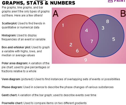
Venn diagram [ven]- диаграмма Венна -a diagram representing mathematical or logical sets pictorially (наглядно.графически) as circles or closed curves (замкнутая кривая) ( within an enclosing rectangle (the universal set), common elements of the sets being represented by the areas of overlap among the circles set-множество
histogram- гистограмма график, состоящий из вертикальных или горизонтальных полос, высота и/или ширина которых представляют значения конкретных данных, что позволяет наблюдателю видеть соотношение их величин Gantt chart [gant]- график (диаграмма) Ганта особый вид графиков для планирования сложных проектов; горизонтальная линейчатая (линейная) диаграмма, на которой параллельно выполняемые задачи проекта представляются протяженными во времени перекрывающимися отрезками
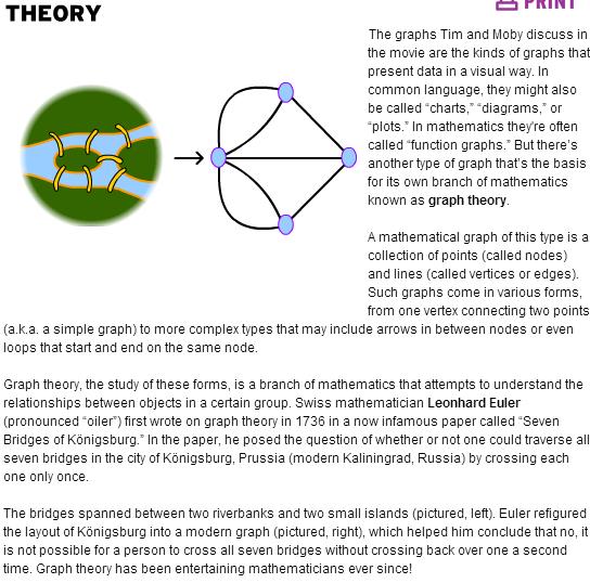
graph theory- теория графов(the mathematical theory of the properties and applications of graphs)
node [nəud] -точка, в которой кривая пересекает себя,) вершина (дерева, графа) ; узел (дерева, графа, сети)
vertex ['vɜ:teks] 1) вершина (угла, кривой)
span - соединять берегa