|
|
Write a report describing the information in the graph below.
- You should write at least 150 words.
- You should spend about 20 minutes on this task.
model answer:
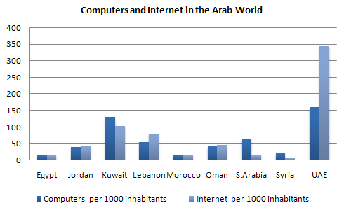
The chart shows striking differences in the level of computer and Internet penetration in the Arab world.
The UAE and Kuwait are by far the most computerized countries, with Lebanon a distant third. The UAE has over 150 computers for every 1000 inhabitants, compared to Kuwait's 130 and Lebanon's 60. In contrast, countries such as Egypt, Morocco and Syria have less than 20 computers per 1000 inhabitants.
There are also great differences in Internet use and availability. The UAE has by far the highest proportion of users, with more than one-third of its population using the Internet. Kuwait and Lebanon are second and third again, with 100 users per thousand in Kuwait and 80 in Lebanon. In some countries the number using the Internet is negligible: Saudi Arabia has less than 20 users per thousand, and there are fewer than 5 users per thousand in Syria.
One unusual feature of the graph is that Internet use does not seem to be directly related to the number of computers. In several countries (the UAE, Lebanon, Jordan and Oman), there are more Internet users per thousand people than computers. However, in other countries, such as Kuwait, Saudi Arabia and Syria, the number of Internet users is lower than the number of computers.
In summary, there are major differences between computer use and Internet use in the Arab world, but the UAE clearly leads the area in both number of computers and number of internet users per capita.
IELTS Graph #16
The graph below shows the different modes of transport used to travel to and from work in one European city in 1960, 1980 and 2000.
Write a report for a university lecturer describing the information below.
- You should write at least 150 words.
- You should spend about 20 minutes on this task.

model answer:
The graph shows the changing patterns in commuting by train, car, tube or bus for commuters in London in the years 1960, 1980 and 2000.
The number of people using trains at first rose from just under 20% in 1960 to about 26% in 1980, but then fell back to about 23% in 2000.
Use of the tube has been relatively stable, falling from around 27% of commuters in 1960 to 22% in 1980, but climbing back to reach 25% by 2000.
On the other hand, the use of cars increased steadily from just over 5% in 1960 to 23% in 1980, reaching almost 40% by 2000, whereas the popularity of buses has declined since 1960, falling from just under 35% in 1960 to 27% in 1980 and only 15% in 2000.
The graph indicates the growing use of cars for commuting to work between 1960 - 2000, and the corresponding decline in the popularity of buses from being the most popular mode of transport in 1960 to the least popular in 2000.
IELTS Graph #17