|
|
Summarise the information by selecting and reporting the main features, and make comparisons where relevant.
You should write at least 150 words.
Give reasons for your answer and include any relevant examples from your own knowledge or experience.
model answer:
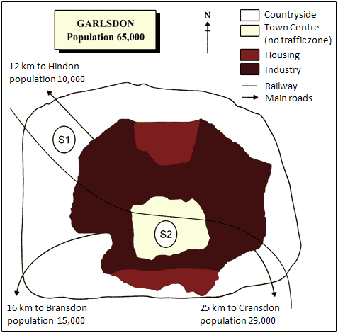
The first potential location (S1) is outside the town itself, and is sited just off the main road to the town of Hindon, lying 12 kms to the north-west. This site is in the countryside and so would be able to accommodate a lot of car parking. This would make it accessable to shoppers from both Hindon and Garlsdon who could travel by car. As it is also close to the railway line linking the who towns to Cransdon (25 km to the south-east), a potentially large number of shoppers would also be able to travel by train.
In contrast, the suggested location, S2, is right in the town centre, which would be good for local residents. Theorically the store could be accessed by road or rail from the surrounding towns, including Bransdon, but as the central area is a no-traffic zone, cars would be unable to park and access would be difficult.
Overall, neither site is appropriate for all the towns, but for customers in Cransdon, Hindon and Garlsdon, the out-of-town site (S1) would probably offer more advantages.
(179 words)
IELTS Graph #45
You should spend about 20 minutes on this task.
The charts below show the percentage of their food budget the average family spent on restaurant meals in different years. The graph shows the number of meals eaten in fast food restaurants and sit-down restaurants.
You should write at least 150 words.
Give reasons for your answer and include any relevant examples from your own knowledge or experience.


model answer:
Over the past 30 years, the average family has dramatically increased the number of meals that they eat at restaurants. The percentage of the family's food budget spent on restaurant meals steadily climbed. Just 10 percent of the food budget was spent on restaurant meals in 1970, and 15 percent in 1980. That percentage more than doubled in 1990, to 35 percent, and rose again in 2000 to 50 percent.
Where families eat their restaurant meals also changed during that 30-year period. In 1970, families ate the same number of meals at fast food and sit-down restaurants. In 1980, families ate slightly more frequently at sit-down restaurants. However, since 1990, fast food restaurants serve more meals to the families than do the sit-down restaurants. Most of the restaurant meals from 2000 were eaten at fast food restaurants. If this pattern continues, eventually the number of meals that families eat at fast food restaurants could double the number of meals they eat at sit-down restaurants.
(164 words)
IELTS Graph #46
You should spend about 20 minutes on this task.
The take below gives information about the underground railway systems in six cities.
Summarise the information by selecting and reporting the main features, and make comparisons where relevant.
You should write at least 150 words.
| Underground Railways Systems |
| City | Date opened | Kilometres of route | Passengers per year (in millions) |
| London | |||
| Paris | |||
| Tokyo | |||
| Washington DC | |||
| Kyoto | |||
| Los Angeles |
model answer:
The table shows the details regarding the underground railway systems in six cities.
London has the oldest underground railway systems among the six cities. It was opened in the year 1863, and it is already lye years old. Paris is the second oldest, in which it was opened in the year 1900. This was then followed by the opening of the railway systems in Tokyo, Washington DC and Kyoto. Los Angeles has the newest underground railway system, and was only opened in the year 2001. In terms of the size of the railway systems, London, For certain, has the largest underground railway systems. It has 394 kilometres of route in total, which is nearly twice as large as the system in Paris. Kyoto, in contrast, has the smallest system. It only has 11 kilometres of route, which is more than 30 times less than that of London.
Interestingly, Tokyo, which only has 155 kilometres of route, serves the greatest number of passengers per year, at 1927 millions passengers. The system in Paris has the second greatest number of passengers, at 1191 millions passengers per year. The smallest underground railway system, Kyoto, serves the smallest number of passengers per year as predicted.
In conclusion, the underground railway systems in different cities vary a lot in the site of the system, the number of passengers served per year and in the age of the system.
(233 words)
This is an answer written by a candidate who achieved a Band 7 score. Here is the examiner's comment:
This answer selects and describes the information well. Key features are clearly identified, while unexpected differences are highlighted and illustrated. The answer is relevant and accurate with a clear overview.
Information is well-organised using a good range of signals and link words. These are generally accurate and appropriate, although occasional errors occur.
The writer successfully uses some less common words. There is a clear awareness of style but there are occasional inaccuracies and there is some repetition. Grammar is well-controlled and sentences are varied and generally accurate with only minor errors.
IELTS Graph #47
You should spend about 20 minutes on this task.
The table below shows the proportion of different categories of families living in poverty in Australia in 1999.
Summarise the information by selecting and reporting the main features, and make comparisons where relevant.
You should write at least 150 words.
Give reasons for your answer and include any relevant examples from your own knowledge or experience.
| Family type | Proportion of people from each household type living in poverty |
| single aged person aged couple single, no children couple, no children sole parent couple with children all households | 6% (54,000) 4% (48,000) 19% (359,000) 7% (211,000) 21% (232,000) 12% (933,000) 11% (1,837,000) |
model answer:
The table gives a breakdown of the different type of family who were living in poverty in Australia in 1999.
On average, 11% of all households, comprising almost two million people, were in this position. However, those consisting of only one parent or a single adult had almost doubt this proportion of poor people, with 21% and 19% respectively.
Couples generally tended to be better off, with lower poverty levels for couples without children (7%) than those with children (12%). It is noticeable that for both types of household with children, a higher than average proportion were living in poverty at this time.
Older people were generally less likely to be poor, though once again the trend favoured eldery couples (only 4%) rather than single eldery people (6%).
Overall the table suggests that households of single adults and those with children were more likely to be living in poverty than those consisting of couples. (154 words)
IELTS Graph #48
You should spend about 20 minutes on this task.
The graph below compares the number of visits to two new music sites on the web.