|
|
Write a report for a university lecturer describing the information below.
- You should write at least 150 words.
- You should spend about 20 minutes on this task.

model answer:
The chart shows male and female graduates from the Higher Colleges of Technology colleges in the UAE.
The most outstanding feature of the graph is female graduates outnumber males in all the colleges. For example, in Dubai, there are 30% more women graduates than men. There are also large differences in Al Ain and in Ras Al Khaimah. However, the number of men and women is almost equal in the colleges in Abu Dhabi.
There are also big differences in the sizes of the colleges. Ras Al Khaimah has less than 300 students altogether, while Abu Dhabi has about 600 and Dubai has almost 1000
In summary, women outnumber men in all the colleges, and there are significant differences in the sizes of the colleges.
IELTS Graph #30
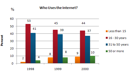
The graph shows Internet Usage in Taiwan by Age Group, 1998-2000.
Summarise the information by selecting and reporting the main features, and make comparisons where relevant.
- You should write at least 150 words.
- You should spend about 20 minutes on this task.
model answer:
The graph shows changes in the age profile of Internet users in Taiwan between 1998 and 2000.
The main users of the Internet in Taiwan are young adults between 16 and 30 years old. In 1998, they accounted for more than half of all users. In 1999 the number dropped slightly to 45%, but even in 2000 they were the biggest group.
The second biggest group of users is aged between 31 and 50. They made up 41% in 1998, falling slightly to 37% in 2000. When combined with the 16-30 age group, over 94% of users in 1998 were between 16 and 50.
However this number is dropping steadily as more children and older users log on. In 1999, the number of children online quadrupled from 2% to 8%, and it continued to increase in 2000. There were similar increases for older users, rising from 4% in 1998 to 10% in 2000.
In summary, while adults between 16 and 50 still represent the great majority of Internet users in Taiwan, their share is declining as more children and older users join the web.
IELTS Graph #31
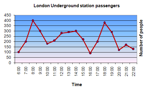
The graph shows Underground Station Passenger Numbers in London.
Summarise the information by selecting and reporting the main features, and make comparisons where relevant.
- You should write at least 150 words.
- You should spend about 20 minutes on this task.
model answer:
The graph shows the fluctuation in the number of people at a London underground station over the course of a day.
The busiest time of the day is in the morning. There is a sharp increase between 06:00 and 08:00, with 400 people using the station at 8 o'clock. After this the numbers drop quickly to less than 200 at 10 o'clock. Between 11 am and 3 pm the number rises, with a plateau of just under 300 people using the station.
In the afternoon, numbers decline, with less than 100 using the station at 4 pm. There is then a rapid rise to a peak of 380 at 6pm. After 7 pm, numbers fall significantly, with only a slight increase again at 8pm, tailing off after 9 pm.
Overall, the graph shows that the station is most crowded in the early morning and early evening periods.
IELTS Graph #32
You should spend about 20 minutes on this task.
The line graph below gives information on cinema attendance in the UK.
Write a report for a university lecturer describing the information given.
You should write at least 150 words.

model answer:
The given line graph illustrates information on the percentage of people who went to the movies in the United Kingdom between 1990 and 2010. The people's attendance is divided into four different age groups.
Overall, younger people seemed to, and are predicted to, be more active in movie going than their older counterparts. However, all four age groups showed a gradual increase in attendance numbers during the given period, except for a slight drop between 1995 and 2000.
To be specific, a larger percentage of people between the ages of 24 and 34 went to, and are expected to, go to the cinema than those in any other age group. Approximately 51% of the respondents from this age group are expected to attend movies in 2010 compared with only 38% in 1990. Even in the group that had the smallest number of movie goers, those between the ages of 44 and 54, there was an increase of 6% in their attendance.
(161 words)
IELTS Graph #33
You should spend about 20 minutes on this task.
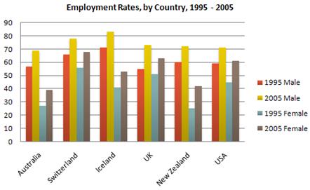
The graph above show information of employment rates across 6 countries in 1995 and 2005.
Summarize the information by choosing and describe the main idea, and make comparisons where appropriate.
You should write at least 150 words.
model answer:
The graph shows changes in employment rates in six countries between 1995 and 2005, for men and women. Overall more and more people of working age are employed, and there have been significant improvements for women, although they leg behind men in entering the workforce.
The most obvious trend in the graph is that women have lower employment rates in most of the countries in the graph. For example, in Australia in 1995, 57 percent of men could find work or retain a job, but only 27 percent of women. The difference was even bigger in New Zealand, with 60 percent of women. Even in Switzerland and Iceland, alightly more men than women were in the job market.
The second biggest trend in the graph is the improvement in employment between 1995 and 2005. In all countries shown, figures for both men and women improved. The biggest change was in the United Kingdom, from 55 percent of men in 1995 to 73 percent over the ten years period.
Furthermore, the increases in employment rates for women were much higher in New Zealand. The percentage of working women jumped from 25 percent to 42 percent, and in the United States from 45 percent to 61 percent over the decade.
In conclusion, all the countries in the graph showed at least a 12 percent increase in employment rates of both men and women over the ten yeares. While men had relatively higher employment rate throughout the period, more and more women appear to be entering the labour market.
IELTS Graph #34
You should spend about 20 minutes on this task.
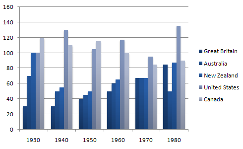
The table below shows the figures for imprisonment in five countries between 1930 and 1980.
Write a report for a university, lecturer describing the information shown below.
You should write at least 150 words.
model answer:
The table shows that the figures for imprisonment in the five countries mentioned indicate no overall pattern of increase or decrease. In fact there is considerable fluctuation from country to country.
In Great Britain the numbers in prison have increased steadily from 30 000 in 1930 to 80,000 in 1980. On the other hand in Australia, and particularly in New Zealand the numbers fell markedly from 1930 to 1940. Since then they have increased gradually, apart from in 1980 when the numbers in prison in New Zealand fell by about 30,000 from the 1970 total. Canada is the only country in which the numbers in prison have decreased over the period 1930 to 1980, although there have been fluctuations in this trend. The figures for the United States indicate the greatest number of prisoners compared to the other four countries but population size needs to be taken into account in this analysis. The prison population in the United States increased rapidly from 1970 to 1980 and this must be a worrying trend.
IELTS Graph #35
You should spend about 20 minutes on this task.
The table below shows the consumer durables (telephone, refrigerator, etc.) owned in Britain from 1972 to 1983.
Write a report for a university lecturer describing the information shown below.
You should write at least 150 words.
| Consumer durables | ||||||||
| Percentage of households with: | ||||||||
| central heating | ||||||||
| television | ||||||||
| video | ||||||||
| vacuum cleaner | ||||||||
| refrigerator | ||||||||
| washing machine | ||||||||
| dishwasher | ||||||||
| telephone |
model answer:
The chart shows that the percentage of British households with a range of consumer durables steadily increased between 1972 and 1983. The greatest increase was in telephone ownership, rising from 42% in 1972 to 77% in 1983. Next came centralheating ownership, rising from 37% of households in 1972 to 64% in 1983. The percentage of households with a refrigerator rose 2 1% over the same period and of those with a washing machine by 14%. Households with vacuum-cleaners. televisions and dishwashers increased by 8%, 5% and 2% respectively. In 1983. the year of their introduction, 18% of households had a video recorder.
The significant social changes reflected in the statistics are that over the period the proportion of British houses with central heating rose from one to two thuds, and of those with a phone from under a half to over three-quarters. Together with the big increases in the ownership of washing machines and refrigerators, they are evidence of both rising living standards and the trend to lifestyles based on comfort and convenience.
IELTS Graph #36
You should spend about 20 minutes on this task.
The line graph below shows the number of annual visits to Australia by overseas residents. The table below gives information on the country of origin where the visitors came from. Write a report for a university lecturer describing the information given.
You should write at least 150 words.

| NUMBER OF VISITORS (million) |
| SOUTH KOREA JAPAN CHINA USA BRITAIN EUROPE | 2.9 3.2 0.3 0.4 0.9 1.1 | 9.1 12.0 0.8 1.1 2.9 4.5 |
| Total | 8.8 | 30.4 |
model answer:
The given line graph illustrates information on the number of overseas visitors traveling to Australia in millions of people. Overall, one notable trend seems to be that Australia has steadily become more popular as a destination spot. For example, there were 20 million more visitors to Australia in 2005 than in 1975. That's a jump from 10 million to 30 million in 20 years.
The second table gives statistics showing the countries whose residents went to Australia between 1975 and 2005. In both years, the largest number of visitors came from Japan, followed by South Korea and Europe. Britain, the United States and China also had many people traveling to Australia in these years. In fact, the number of people visiting Australia grew in every one of these countries. For example, in 2005, 12 million people went there from Japan compared with only 3.2 million in 1975.
(147 words)
IELTS Graph #37
You should spend about 20 minutes on this task.
The graphs show enrolment in different colleges in the Higher Colleges of Technology in 1999.
Write a total of 150 - 200 words about the information in the three graphs.
Write a report for a university lecturer describing the information given.
You should write at least 150 words.


model answer:
The charts shows student enrolment by gender and level in different colleges of the Higher Colleges of Technology colleges in the UAE.
There are clear differences in male and female enrolment. Females outnumber men in all the colleges, with almost 25% more students in Dubai Women's college than in Dubai Men's. Ras Al-Khaimah Women's College has almost 180 students, compared to only 100 in the Men's college.
Females also outnumber males by level, with almost double the number of men at Higher Diploma level (330 compared to 181). Only at Diploma level does the number of men slightly exceed that of women.
Over half the students are in Certificate level, with less than a quarter at Higher Diploma or Bachelor level.
In conclusion, most students in the Higher Colleges are enrolled at Diploma level or below, and the majority of students are women.
(143 words)
IELTS Graph #38
You should spend about 20 minutes on this task.
The chart shows the number of mobile phones and landlines per 100 people in selected countries.
Write a report for a university lecturer describing the information given.
You should write at least 150 words.

model answer:
The graph shows the number of mobile phones and landlines per 100 users, for selected countries. Overall, most of the countries included in the graph have more mobile phones subscribers than landlines.
Most European countries have high mobile phone use. The biggest users of mobile phones are the Italians, with 88 cell phones per 100 people. For example, Italy has twice as many mobile phones as landlines, with 88 mobiles per hundred people compared to 45 for landlines. Mobile phone use is low in Canada, with fewer than 40 phones per 100 people. Denmark is also unusual because it has slightly more landlines than mobile phones.
However, in some countries, the number of landlines is higher than the number of mobile phones. One example is the USA, where the number of mobiles, at 50 per 100 people, is much lower than the number of landlines, at almost 70 per hundred. A similar pattern can be seen in Canada. The highest number of landlines in the graph is in Denmark, with about 90 per 100 people. In contrast, the lowest figures for fixed lines are in Italy and the UK.
In conclusion, it seems that mobile phone use is higher in Europe than in North America.
IELTS Graph #39
You should spend about 20 minutes on this task.
The chart below shows estimated world literacy rates by region and by gender for the year 2000.